
We’ve noticed how many promising ideas lose steam when design feels confusing or undervalued.
Whether you’re launching a new product or refining an existing one, a strong foundation in design fundamentals can make all the difference.
Introduction
This guide was made to close that gap: offering clear, easy-to-understand explanations of the key design terms that shape user experiences.
Our hope is that it empowers you to lead with confidence, ask smarter questions and create products people love to use.
Let's begin with understanding the essential design terms for building great products and services:
UX (User Experience)
Is the overall experience a person has when using a product or service, focusing on how easy, efficient and enjoyable it is.
Good UX is about making things simple, clear and smooth: from the first interaction to the final click. You test, tweak and make sure everyone can use it comfortably.
The goal? It should just feel right.

Bad UX in an app means: getting lost in confusing menus, waiting too long for things to load or not knowing what just happened when something goes wrong.
UI (User Interface)
Is the visual design and interactive parts of a digital product: like buttons, menus, icons, colors, fonts and spacing. It’s how the product looks.
Good UI feels clean, clear and consistent. Buttons look tappable, fonts are readable and colors support the message without shouting.
You don’t have to think twice, it all just makes sense and looks polished.
Bad UI is when everything’s shouting for attention but nothing helps you move forward. Think tiny text, clashing colors, buttons in weird places or layouts that look like they were never meant to work on your screen.
It’s frustrating and it makes people want to leave before they even begin
Discovery Workshop
Is a hands-on session at the very beginning of a project where everyone involved in the project gets together to align on goals, understand users and map out the plan ahead.
The presence of a discovery workshop clears the air early.
It helps teams align on what matters, uncover user needs and flag any roadblocks (like tight deadlines or tech limitations) before they surprise you later.
It’s how you shape realistic goals and focus on the features that really matter.

Skipping it might seem like a shortcut, but it usually costs more time later.
Without a shared direction, teams can go off-track, build stuff users don’t want or waste energy fixing things that could’ve been spotted on day one.
User Persona
Is a profile that represents a typical user of your product. It captures things like their background, goals, pain points and behaviors, so your team can design with real people in mind.
User personas keep everyone grounded in the user’s world.
They help you understand what motivates your audience, what frustrates them and what kind of experience they’re actually looking for. When the whole team knows who they’re building for, it’s way easier to make smart, user-centered decisions.
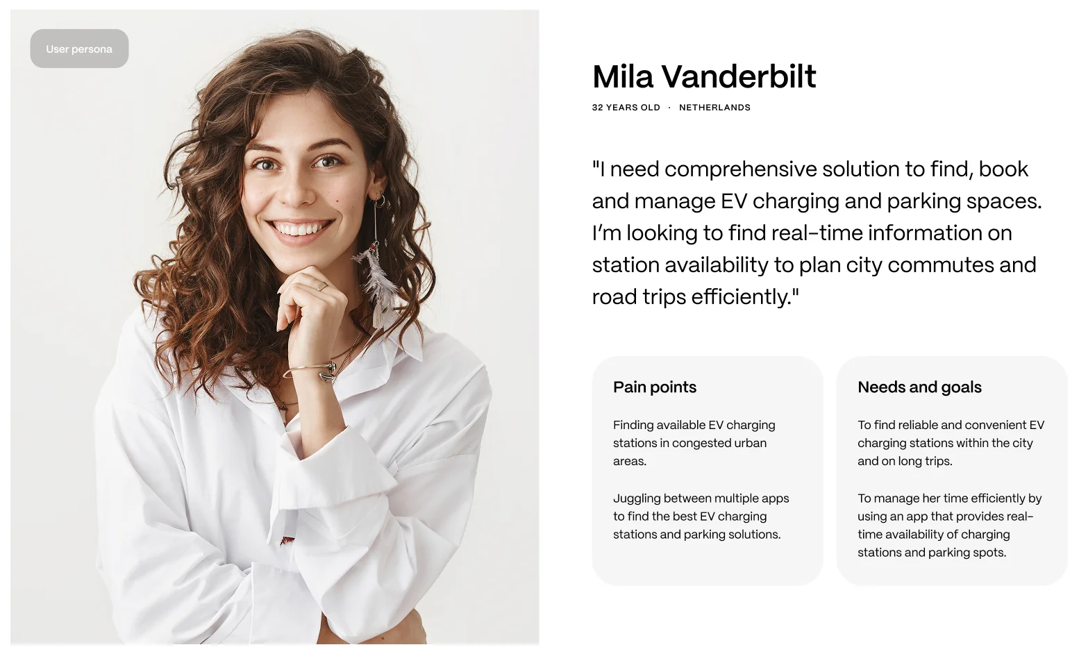
Without a persona, it’s easy to fall into guesswork. That’s when you risk building features no one asked for, confusing your users or missing the real problems altogether.
User Journey
Represents the steps someone takes to complete a task in your product: from the moment they start to the moment they achieve their goal.
When the user journey is present, it helps your team spot friction points, uncover emotional highs and lows and design an experience that actually supports your users.
It makes sure you're not just building features, but shaping a full experience that makes sense from start to finish.

Skip this step and you're basically designing in the dark.
You might miss the real pain points or overlook simple opportunities to make users smile and that’s when your product starts feeling messy, confusing or just off.
Prioritising Features
Is all about deciding what to build first, based on what users actually need, what moves your business forward and what your team can realistically deliver.
When you prioritise well, your team stays focused on building the right things at the right time.
It keeps development lean, your product clear and users happy with a strong core experience.

Skip this step and it’s easy to get pulled in too many directions. You end up with too many half-built features, missed deadlines and a product that feels bloated instead of useful.
Competitive Analysis
Means taking a good look at what similar products or services are doing, what they’re nailing, where they’re falling short and how they’re positioning themselves in the market.
Done right, competitive analysis helps you avoid common pitfalls, spot real gaps in the market and figure out how to deliver more value to your users.
It gives your team a strategic edge.

Skipping it? You might end up repeating mistakes your competitors already made or miss out on trends your users expect.
It’s like walking into a crowded market without knowing what the crowd actually wants.
Sitemap
Is a simple visual or written outline of all the pages on your website and how they’re connected. It helps everyone, from designers to developers to stakeholders see the full picture of the site’s structure.
With a sitemap in place, your team knows exactly where each piece of content lives.
It keeps things organized, makes navigation easier for users and ensures nothing important gets lost or repeated.

Skip the sitemap, and you risk building a site that’s hard to navigate, confusing to grow and frustrating for users.
It’s easy to end up with scattered pages, dead ends or missing links, none of which help people stick around.
Moodboard
Is a visual collage or collection of images, colors, typography, textures and design elements that capture the overall look, feel and tone of a project.
When a moodboard is part of the process, it gives everyone a clear visual direction from the start.
It helps the team stay in sync, makes creative decisions easier and keeps the final design looking polished and consistent.

Without a moodboard, things can get messy fast.
Styles might clash, feedback turns into guesswork and the design can drift off course, often ending up with something that just doesn’t feel quite right.
Art Direction
Is about setting the visual tone for your product, defining how things should look, feel and come together. It guides everything from colors and typography to imagery and layout, making sure it all tells the same story.
When you have strong art direction, your product looks polished and purposeful.
Every screen feels consistent and on-brand and users instantly get the right emotional feel.

Without it, things get messy.
Different visuals might clash, branding feels unclear and the product starts to look like it was stitched together without a plan which can confuse users and weaken trust.
Wireframes
Are simple, low-fidelity layouts that outline the structure and key elements of a web page or app screen. They focus on content placement, user flow and functionality, not visuals like color, images or detailed styling.
When wireframes are present, they give teams a clear structure to build on.
They help everyone agree on layout and functionality early, making it easier to spot usability issues before investing time in visuals.

Without wireframes, teams may jump straight into visual design without a solid foundation. This often leads to messy layouts, confusing flows and lots of rework, like decorating a house before deciding where the walls go.
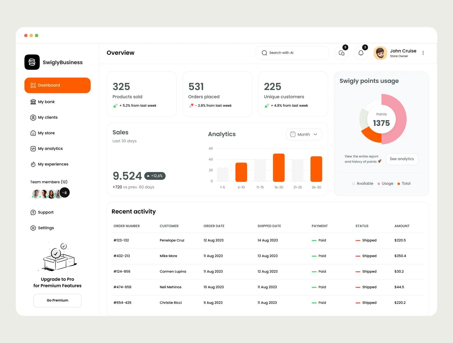
High-Fidelity Screens
Are detailed, polished visual representations of a digital interface. They include real content, branding, colors, typography, icons, imagery and interactive elements to show exactly how the product will look and feel.
Good high-fidelity screens help teams spot visual or usability issues early, make decisions with confidence and get realistic feedback from stakeholders and users.
.webp)
When hi-fi screens are missing or rushed, the product can feel unfinished or inconsistent. Teams might rely on guesswork, overlook visual details or run into surprises during development, leading to extra fixes and a less refined user experience.
Responsive Design
Is a web design approach that ensures a website or app looks and works well on all screen sizes, from mobile phones and tablets to desktops, by automatically adjusting layout, content and functionality to fit the device.
When responsive design is present, users get a smooth, consistent experience whether they’re on a phone, tablet or desktop.
Content feels natural to read, buttons are easy to tap and nothing breaks as the screen size changes.

Without responsive design, things quickly fall apart. Text becomes hard to read, images overflow and buttons might not even work properly.
Users get frustrated, bounce faster and trust in your product drops, all because it wasn’t built to adapt.
Design System
Is a collection of reusable components, design rules, style guides and documentation that ensures consistency and efficiency across a product’s user interface.
When a design system is present, teams work more efficiently, designs stay consistent across pages and products and developers know exactly what to build and how.

Without a design system, it’s like building with random pieces from different toy sets, nothing quite matches, everything takes longer and the end result can feel messy or disjointed.
Inconsistencies sneak in, updates become harder to manage and scaling the product gets chaotic fast
Grid System
Is a layout structure made up of columns that helps designers align and organize visual elements consistently across screens.
When a grid system is in place, designs feel organized and easy on the eyes, making content flow naturally and helping users focus on what matters.

Without a grid system, layouts can feel chaotic or uneven, with elements that seem randomly placed.
This can confuse users and make the design look messy or unprofessional, turning what should be a smooth experience into a frustrating one.
Typography
Is arranging text, including font choice, size, spacing and alignment, to make written content readable, visually appealing.
When typography is done well, text is easy to read, looks inviting and perfectly matches your brand’s personality, making the whole experience smoother and more enjoyable.

Without thoughtful typography, text can feel confusing or tiring to read.
Poor font choices, inconsistent sizes or cramped spacing make content hard to follow, leaving users frustrated or missing your message entirely.
Color
Refers to the use of hues to create visual interest, communicate emotions, convey brand identity and guide user behavior.
When color is used thoughtfully, it creates visual interest, reinforces your brand and even signals what actions users should take, making the whole product feel inviting and easy to use.

Without a clear color strategy, designs can feel dull, confusing or overwhelming.
Random or clashing colors make it hard for users to focus or understand what’s important and the product might lose its identity or emotional connection. It’s like wearing mismatched clothes that don’t quite fit together.
Spacing
Refers to the use of empty areas, like padding, margins and line spacing to create visual clarity, structure and balance in a layout.
When spacing is done right, it improves readability, guides the eye naturally and makes the design easy to use and enjoyable to explore.
Good spacing keeps everything balanced and comfortable to navigate.

Without proper spacing, designs feel cramped and overwhelming, like a cluttered room where you can’t move freely.
Text gets hard to read, buttons look crowded and users might get frustrated trying to find what they need.
Border Radius
Controls the roundness of the corners of UI elements like buttons, cards, input fields and images. It defines how sharp or smooth the corners appear.
In digital design, adding a border radius smooths the edges of buttons, cards and fields, making the interface feel approachable and modern.

Without border radius, UI elements can look harsh or outdated, with sharp corners that feel cold or uninviting.
Rounded corners help create a softer, more welcoming experience that users find easier and nicer to interact with.
Icon Library
An icon library is a collection of icons that designers and developers use in digital products to represent actions, objects or ideas visually.
When a design uses a consistent icon library, users quickly understand actions like delete, search or settings, making the experience smoother and more intuitive.
Plus, designers save time by reusing trusted icons instead of creating new ones from scratch.

Without an icon library, icons can feel random or confusing, with different styles or unclear meanings.
This inconsistency slows users down and makes the interface look messy, hurting usability and the overall feel of the product.
Illustration
Refers to images created to visually explain, decorate or enhance content in digital products.
When illustrations are used thoughtfully, they make a product feel lively, engaging and memorable, helping users connect emotionally and navigate more easily.

Without illustrations, interfaces can feel flat or dull, making it harder to explain ideas or catch users’ attention.
The design risks coming across as cold or boring, which can lead to a less memorable and less enjoyable experience.
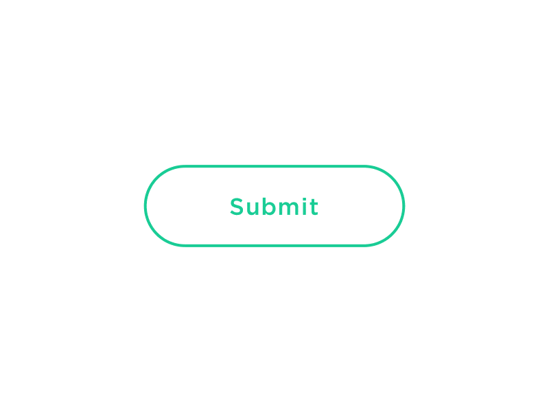
Interactive Prototype
Is a clickable, often high-fidelity mockup of a digital product that simulates user interactions like clicks, swipes and navigation. It allows designers, developers and stakeholders to experience and test the product flow before development.
A good prototype lets users click through flows, test interactions and give feedback early.
It helps teams spot issues, improve usability and validate ideas before writing a single line of code.

A bad prototype, on the other hand, is confusing, too limited or too detailed too soon.
It might skip key interactions, leading to missed feedback or be so complex that it’s hard to update.
Microinteractions
Are small, subtle animations or design responses within a product that guide users, provide feedback or enhance the experience without interrupting the main flow.
A good microinteraction feels natural and helpful: a heart icon fills with color when liked, a button ripples when tapped or a loading spinner shows progress.
They guide users gently, offer feedback and make the experience feel polished and human.
Without microinteractions, users are left guessing: was that button press successful or not? But too many flashy effects can overwhelm; the sweet spot is using just enough to guide, reassure and add a touch of delight.
Empty State
Is the screen or part of a user interface that appears when there is no content to display: for example, when a user has no messages, no saved items or hasn’t taken any actions yet.
When an empty state is thoughtfully designed, it gently guides the user on what to do next, offers encouragement or suggests actions to take.
It turns “nothing here” into a helpful moment.
With an empty state, users get helpful guidance when there’s nothing to see yet, it feels thoughtful and encouraging.
Without it, a blank screen can confuse users and make the product feel broken or unfinished.
Error State
Is a condition that appears when something goes wrong in a product like a failed form submission, a broken link or an unavailable feature. It alerts the user to the issue and helps them understand how to fix it.
An error state, when done well, doesn’t just flag that something went wrong, it calmly explains the issue and shows users how to fix it.
It’s like saying, “Hey, this didn’t work, but here’s what you can do.”

Without an error state, users are left guessing. A silent failure or vague message creates frustration, breaks trust and makes the product feel unreliable or confusing.
Loading State
Is a temporary condition shown while content is being fetched, processed or rendered. It lets users know the system is working and prevents confusion or impatience during wait times.
A good loading state keeps users informed and reassured.
Even a simple spinner or message like “Fetching your data…” lets people know things are working behind the scenes, reducing frustration during the wait.
.webp)
Without a loading state, users are left staring at a blank screen, unsure if the app is broken or frozen.
That uncertainty can lead to impatience, confusion or even abandoning the task altogether.
A/B Testing
Is a method of comparing two versions of a design, feature or piece of content (Version A and Version B) to see which one performs better based on real user behaviour.
When A/B testing is present, teams make informed decisions based on real user behavior.
It helps uncover what actually works, whether it’s a headline, button color or layout, so designs evolve with evidence, not just gut feeling.

Without A/B testing, choices are mostly guesswork.
You might launch something that seems right but doesn’t connect with users, missing chances to improve engagement, conversions or overall experience.
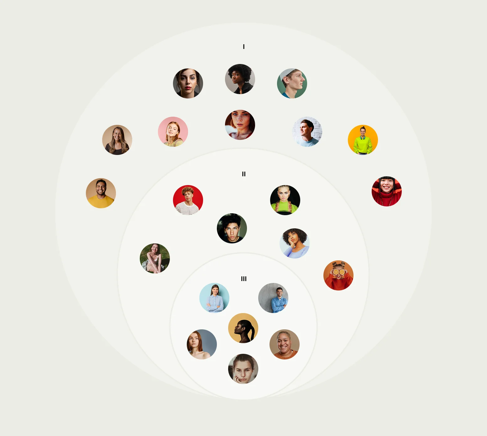
User Interview
A user interview is a research method where designers or researchers talk directly with real users to understand their needs, behaviors, motivations and pain points.
When user interviews are part of the process, teams gain real, human insights.
You hear firsthand what users need, what frustrates them and what truly matters, so design decisions are grounded in reality, not assumptions.

Without user interviews, teams rely on assumptions or second-hand info.
That often means designing for imagined users instead of real ones, missing key needs and building solutions that don’t quite fit.
MVP (Minimum Viable Product)
Is the simplest version of a product that includes only the core features necessary to solve a problem and deliver value to users.
With an MVP, you launch fast and smart, focusing on the essentials that really matter. It lets you test your idea, learn from real users and build the right product step by step.
.svg)
Without an MVP, you might dive into building everything at once, wasting time and resources on features nobody needs. It’s like trying to open a full restaurant before knowing if anyone wants your food.
Design Consistency
Means maintaining uniform visual and functional elements across a product or brand, such as colors, typography, button styles, layout structure and interaction patterns to create a cohesive and predictable user experience.
Good design consistency means everything feels familiar and connected: colors, fonts, buttons and layouts work together so users always know what to expect.
It makes the product feel polished, trustworthy and easy to use.

Without consistency, the design feels scattered and confusing.
Users get thrown off by changing styles or behaviors, which leads to frustration and makes the product harder to navigate.
Conversion Rate
Is the percentage of users who complete a desired action (a “conversion”) out of the total number of users. It’s a key metric used to measure the effectiveness of a product, page or campaign.
Formula:
Conversion Rate = (Conversions ÷ Total Visitors) × 100
When you track and optimize your conversion rate, you understand how well your product or campaign turns visitors into users or customers.
This insight helps you make smart changes that boost success and growth.

Without measuring conversion rate, you’re flying blind: you don’t know what’s working or where people drop off.
That makes it hard to improve and can mean missed opportunities to turn interest into real results.
Hick’s Law
States that the time it takes a person to make a decision increases with the number and complexity of choices. In UX design, it means: the more options you present to users, the slower and harder it is for them to decide.
When Hick’s Law is applied, the design simplifies choices, helping users make decisions quickly and confidently.
This clear focus keeps users engaged and reduces frustration.

Without Hick’s Law, users are hit with too many options at once, which can feel overwhelming and confusing.
This overload often leads to hesitation, mistakes or users giving up altogether.
Fitt’s Law
States that the time required to move to a target (like a button or link) depends on the distance to it and its size. The closer and larger the target, the faster and easier it is to click or tap.
When Fitts’s Law is applied, buttons and links are easy to find and tap, speeding up user actions and reducing frustration.
Targets are sized and placed thoughtfully, making the experience smooth and efficient.

Ignoring Fitts’s Law leads to tiny or distant targets that users struggle to click, slowing them down and causing errors.
This creates a frustrating experience where simple tasks become harder than they should be.
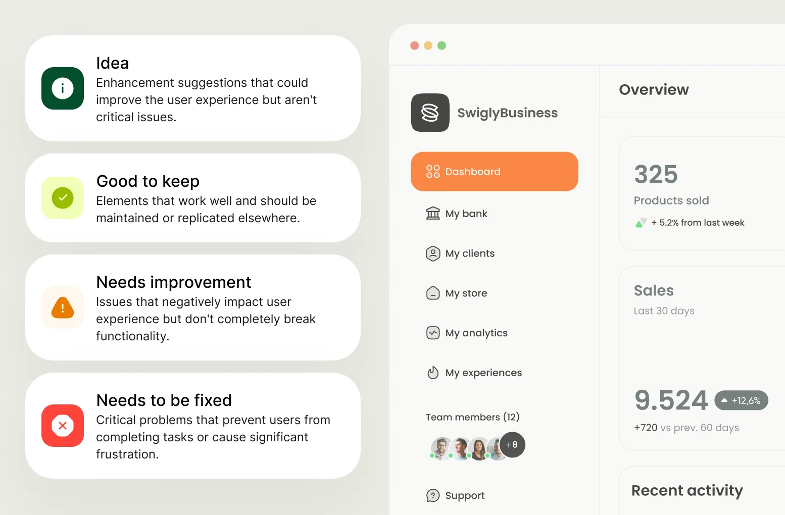
UX Audit
Is a comprehensive evaluation of a product’s user experience to identify usability issues, inconsistencies and opportunities for improvement. It combines expert analysis with user data to enhance overall satisfaction and effectiveness.
With a UX audit, teams spot hidden issues early, fix usability problems and smooth out the user journey, making the product easier and more enjoyable to use.
It’s like a regular check-up that keeps everything running smoothly.
Without a UX audit, problems can go unnoticed, causing frustration and drop-offs.
Small issues build up like hidden engine trouble, leading to a messy experience that drives users away and hurts your product’s success.
Onboarding
Is the process of guiding new users through a product or service to help them understand its value, learn how to use it effectively and encourage continued engagement.
Good onboarding clearly introduces users to the key features and benefits, making it easy to understand how to use the product.
It builds confidence and comfort, encouraging users to engage and explore independently.

Without proper onboarding, users can feel lost and overwhelmed, unsure where to start or what to do next.
This confusion often leads to frustration and causes many to abandon the product early.
Confirmation Bias
Is the tendency to favor information that confirms our existing beliefs or assumptions, while ignoring or dismissing contradictory evidence. In design and research, this can lead to skewed decisions or missed opportunities.
When confirmation bias is present, teams tend to focus only on information that supports their initial ideas, ignoring valuable feedback or data that could improve the design.
This limits innovation and can lead to poor decisions based on incomplete understanding.
Without confirmation bias, teams stay open to all evidence, even if it challenges their assumptions.
This helps uncover real user needs, identify issues early and create solutions that truly work, leading to smarter, more effective designs
Accessibility
Means designing products, services or environments so that people of all abilities, including those with disabilities, can use them easily and effectively.
When accessibility is prioritized, products work smoothly for everyone, including people with disabilities.
This creates a more inclusive experience, broadens your audience and ensures no one is left out.

Without accessibility, users with disabilities face barriers that make products frustrating or impossible to use.
This exclusion not only harms users but also limits the product’s reach and reputation.
Pixel Perfect
Means that a digital design is recreated in code with the exact precision, so that every element, including design rules and elements match the designs from the design editor.
When a design is pixel perfect, every element lines up precisely, creating a clean, polished look that feels professional and trustworthy.
It ensures consistency across devices, giving users a seamless visual experience.
Without pixel-perfect attention, layouts can look messy or uneven, elements might be misaligned or inconsistent.
This sloppy appearance can make the product feel unprofessional and distract users from the content.
Light/Dark Mode
Refers to a user interface design option that allows users to switch between a light-themed (bright background with dark text) and a dark-themed (dark background with light text) version of an app or website.
Offering light and dark modes lets users choose the look that’s easiest on their eyes and fits their environment, improving comfort and accessibility.
It shows care for user preferences and helps reduce eye strain during different times of day.
.webp)
Without this option, users may struggle with uncomfortable brightness or glare, especially in low-light settings, leading to eye fatigue and frustration.
The product feels less adaptable and may lose users who seek a more personalized experience.
Mobile-First Design
Is a design strategy that starts by creating the user experience for mobile devices first, then progressively enhancing it for larger screens like tablets and desktops.
Designing mobile-first ensures the experience is simple, fast and focused on what users really need on small screens.
It builds a solid foundation that scales smoothly to larger devices, preventing clutter and performance issues.
.webp)
Skipping mobile-first often leads to bloated, complicated designs that don’t work well on phones, frustrating users and slowing down the experience.
It risks alienating a huge portion of users who rely on mobile access.
Design Editor
Is a software tool that allows designers to create, modify and arrange visual elements such as layouts, images, typography and colors for digital products like websites and apps.
A good design editor makes it easy and fun to build and tweak layouts, images, fonts and colors. It helps you work faster and keeps everything looking clean and consistent. At ElevenSpace we use Figma for everything design.

A bad design editor feels outdated and frustrating, making it hard to get things looking right. It slows you down, causes mistakes and leaves your design looking messy or inconsistent.
____
Having a solid grasp of these UX/UI fundamentals empowers you to make better design choices and work more effectively with your team.
It helps you prioritize what really matters, building products that users find intuitive and enjoyable.
Keep this guide as a reference throughout your journey and use it to ask the right questions and steer your product in the right direction.


.webp)
.webp)
