1. Executive Summary
Hostelworld has always been the go-to place for travelers looking to book fun, affordable and unique hostels around the world. With listings in over 180 countries, more than 13.7 million reviews and support for 19 languages, it’s built a truly global community.
During the pandemic, bookings took a huge hit, dropping by 97%.
But instead of hitting pause, Hostelworld used that time to completely redesign all their user-facing platforms: the website, admin dashboard and mobile apps (iOS and Android).
We kicked off by mapping out the “happy path”: the ideal user journey, then created interactive prototypes and applied the new design system across every platform,
Together, we built a unified, scalable design system to refresh their entire ecosystem: website, mobile apps and internal admin tools.
The goal? To make everything smoother, more consistent and way more enjoyable for both travelers and hostel owners.

With over 60% of Hostelworld users traveling solo, 43% booking through the app and 80% under 35 years old, a seamless digital experience is key. These travelers take more than four trips a year, seek cultural and once-in-a-lifetime experiences and care deeply about sustainability.
Hostelworld’s bold app redesign was made with them and their next adventure in mind.
2. The Challenge
When global travel hit pause, Hostelworld’s bookings slowed down too. But behind the scenes, a bigger challenge was waiting.
Over time, their product had grown across different platforms without a shared design foundation to bring it all together. The result? A user experience that felt a little scattered. A button might look one way on the app and completely different on the website. For travelers, this inconsistency could be confusing and frustrating.
On the flip side, it made life tougher for the teams building the product.
Without a clear design language, designers and developers spent too much time fixing small details instead of creating new features. Working across platforms got messy and slow, with design debt piling up. This caused delays, duplicated effort and unhappy users: a problem that only grew as travel picked up again.
They’d started building a design system: a smart first step.
But to truly scale and support a fast-moving product, they needed expert help refining it into something teams could actually use: consistent, intuitive and future-proof. (We’ll dive into how we did that in Section 5.)
This was all about building a solid foundation to help the team work faster, collaborate easier and create a smooth experience everyone loves.
3. Understanding the Industry Shift
Travel is changing fast and Hostelworld knew it had to keep up, not just to stay in the game, but to lead the way.
Sustainability is now a priority for today’s travelers. More travelers want eco-friendly options and are willing to pay a bit extra for stays that prioritize green practices. Hostelworld embraced this by highlighting hostels with green certifications and local community connections, making sustainability a key part of their offer.
Mobile-first is how people plan trips today. With more bookings happening on phones, a smooth, reliable mobile experience became essential.
As part of a broader travel app design strategy, Hostelworld revamped their apps to be fast, clear and easy to use, even when Wi-Fi is spotty
Trust, safety and transparency matter more than ever.
Travelers want clear pricing, honest reviews and visible safety measures. Hostelworld put these front and center, so users could book confidently every step of the way.
All these shifts made one thing clear: a simple facelift wasn’t enough. Hostelworld needed a fresh, thoughtful redesign that matched what today’s travelers really want, while keeping that warm, welcoming spirit they’re known for.
4. Knowing the Users: Key Personas
At the heart of every great product is a solid understanding of the people using it. For Hostelworld, that meant designing for travelers like Lucas Martínez, a 22-year-old student from Portugal who loves spontaneous trips and meaningful connections.
Meet Lucas – The Experience-Seeking Budget Traveler
Lucas is always on the lookout for places full of stories, new people and adventure. Between university classes and freelance gigs, he jumps on budget flights whenever he can, often deciding where to stay just hours before arriving. For Lucas, travel is flexible, mobile and full of surprises.
He usually books hostels on the go, whether on his Android phone or iPad. What matters most to him is speed, simplicity and an experience that keeps up with his fast-paced lifestyle.
What Lucas Wants
Lucas looks for hostels that are social and unique where he can find rooftop dinners, walking tours or places with a creative vibe. Here’s what he needs:
- A quick, confident booking process without slow-loading pages or endless forms
- Real photos and honest reviews, not just polished marketing shots
- The ability to get everything done on mobile, whether he’s at the airport or riding in the back of a tuk-tuk
What’s Getting in the Way
Before the redesign, Hostelworld wasn’t always a perfect fit for Lucas:
- The app and website looked different, which sometimes made him second - guess his choices
- The booking flow was too long and cluttered, especially frustrating when Wi-Fi was patchy
- App glitches and slow performance made it hard to trust the platform - definitely not what a tired traveler wants
How We Designed for Lucas
Using Lucas as our guide, we made sure the new experience is:
- Mobile-first and lightning fast, no matter the device or signal strength
- Consistent across all platforms, so switching between Android, web and iOS feels seamless
- Clear and trustworthy, putting honest reviews, real photos and important hostel info right at his fingertips
We also simplified the booking flow to reduce mental effort:cutting down steps and making key actions easy to find. Now, Lucas can book in minutes without getting lost in menus.
While Lucas is just one persona, he represents most Hostelworld users: young, independent travelers who value simplicity, speed and social connection.
Designing for Lucas meant designing for the future of travel and it paid off. Thanks to streamlined mobile flows and a more intuitive platform, booking drop-offs dropped, mobile conversion rates climbed and user satisfaction soared.
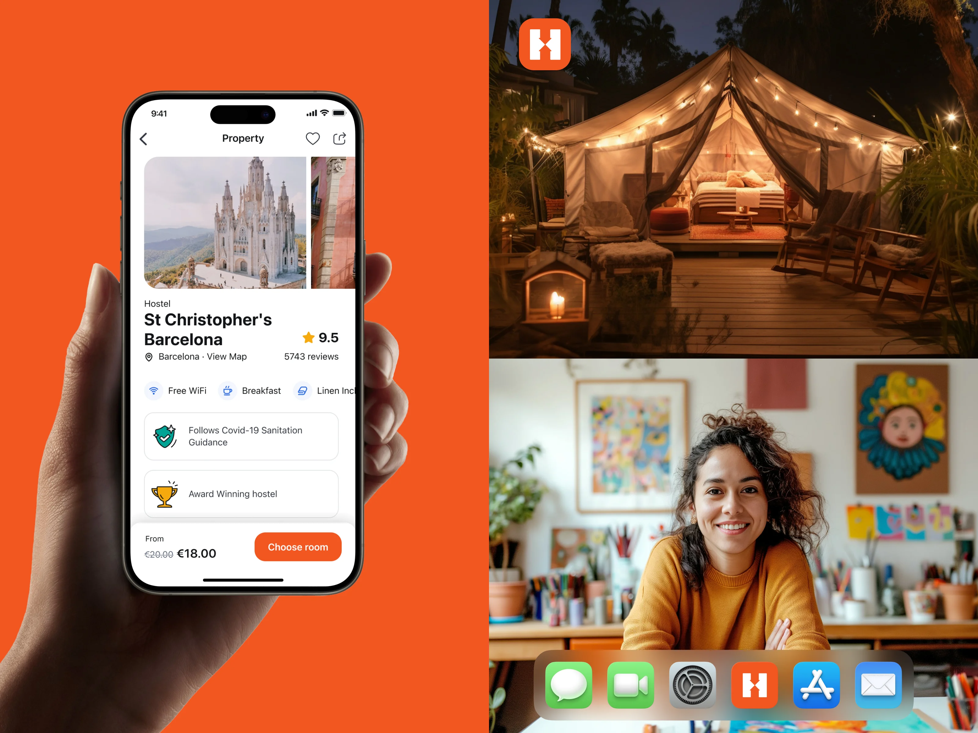
5. The Solution
When Hostelworld realized they needed a more unified design approach across their platforms, they brought us in to help build what was missing: a design system that’s scalable, easy to use and consistent, no matter how or where users were booking.
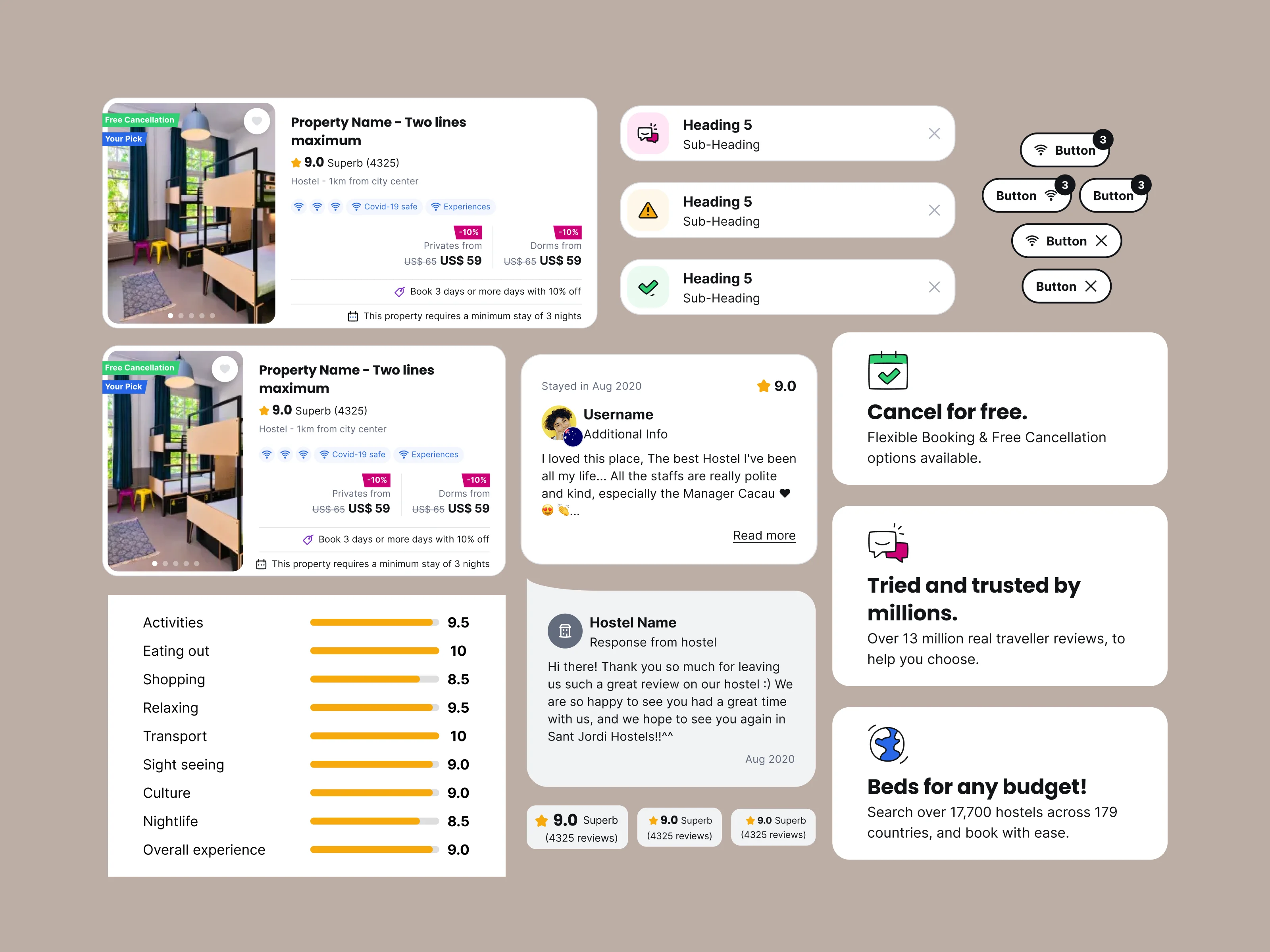
5.1 Establishing a Scalable Design System
We began with a full design audit to uncover inconsistencies and duplicated components that were slowing teams down.
From there, we created a unified design system with reusable components, clear naming conventions and practical guidelines; giving every designer and developer the tools to move faster with confidence.
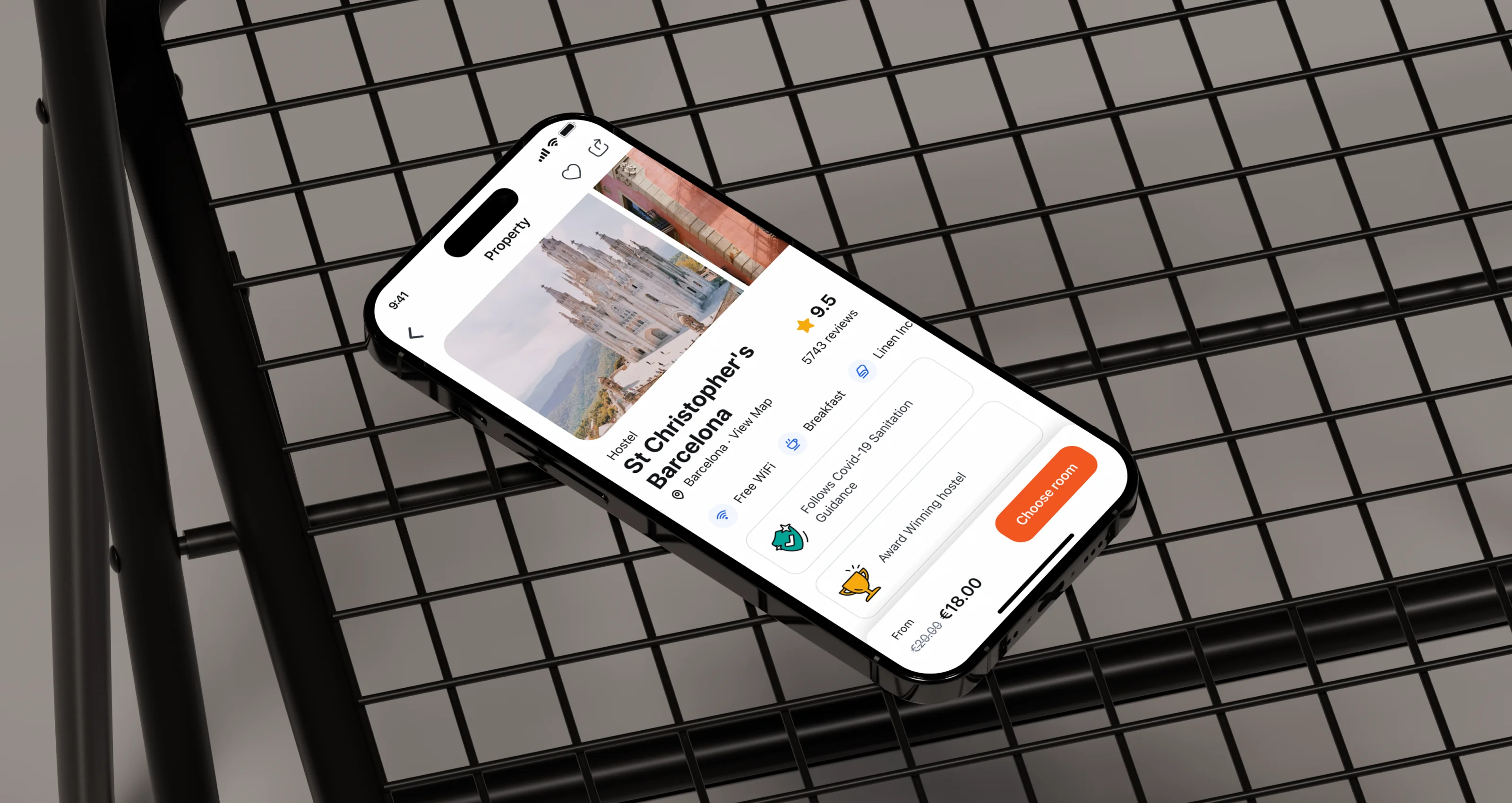
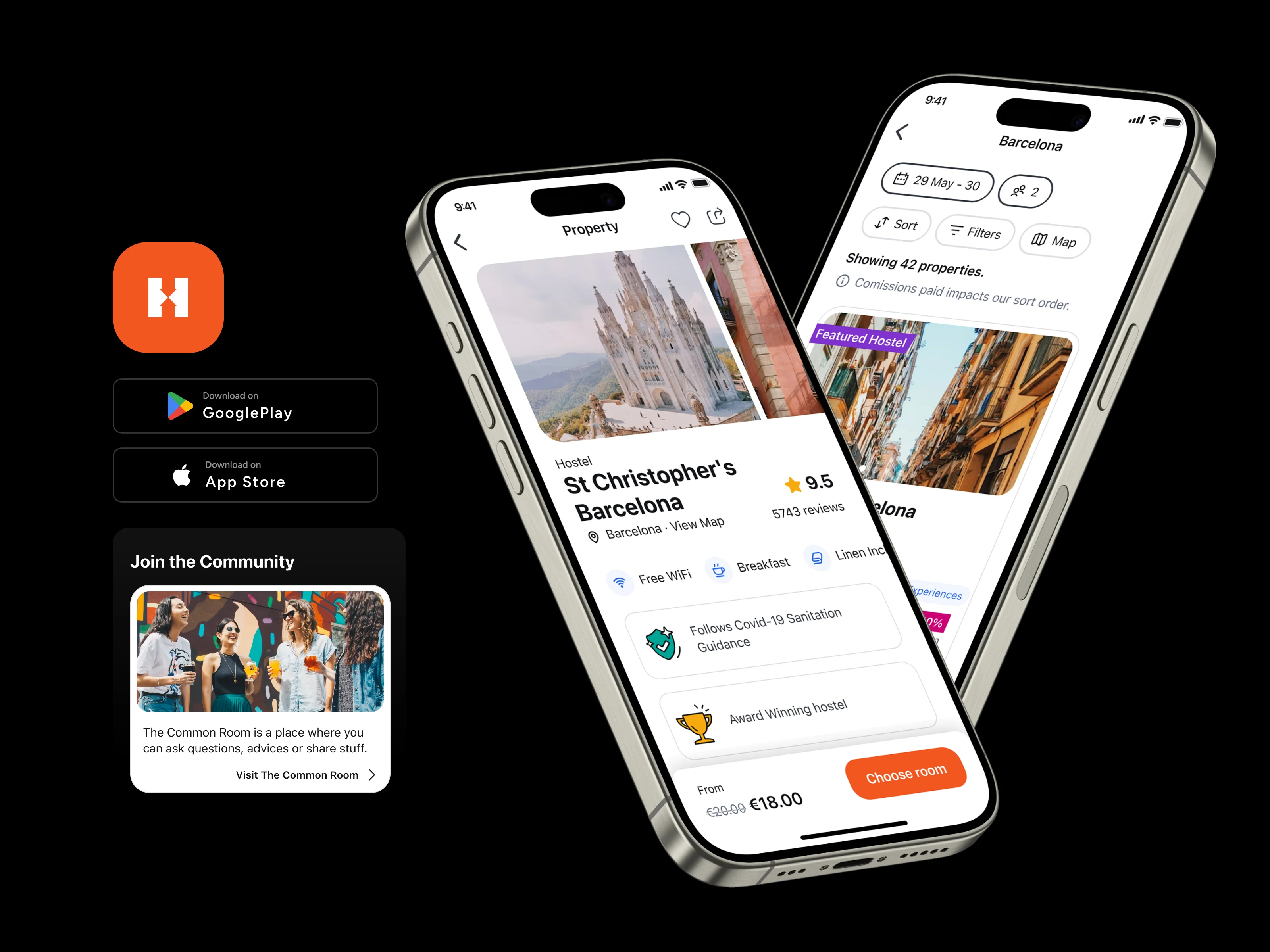
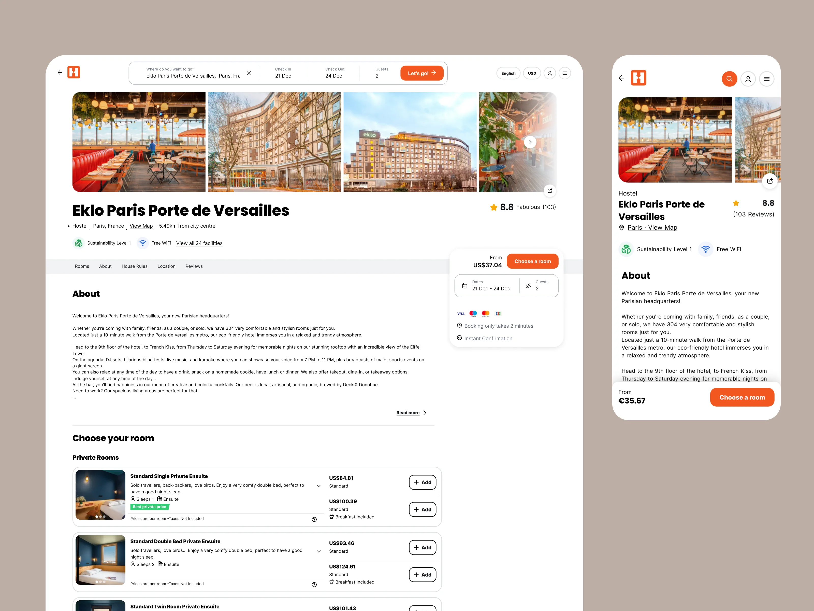
5.2 Redesigning the Core Platforms
With a solid foundation set, we focused on improving Hostelworld’s core platforms, always keeping real user needs front and center:
- Web App:
We streamlined the booking flow to make it faster, clearer and simpler to follow. Clutter was trimmed, visuals polished and responsiveness improved so it worked beautifully on any screen, whether travelers were booking on a laptop at a café or on a tablet in a hostel lounge. - Mobile Apps (iOS & Android):
We modernized the travel app UII with native patterns that feel smooth and intuitive. We also tackled performance and accessibility, making sure users like Lucas could move quickly and confidently in any environment. - Admin App:
We didn’t forget the hostel owners! Their admin tools got a thoughtful makeover too. We simplified the interface, cleared up cluttered workflows and made managing bookings, availability and guest data easier, so owners could spend less time clicking and more time connecting with guests.
5.3 Workflow Optimization
To keep everything flowing smoothly, we mapped out the ideal experience for every user: travelers, hostel staff and internal teams alike. These “happy paths” helped us spot blockers early and fine-tune the overall flow.
Interactive prototypes kept everyone on the same page fast, speeding up decisions and reducing bumps during development.
By anchoring all teams to one shared design language, we made launching new features quicker, with fewer handoffs and better teamwork.
The result? A connected, user-focused digital ecosystem ready to grow with Hostelworld. It’s a system that delights travelers, supports hostel owners and empowers the people building it too.
6. The Impact
The redesign made a tangible difference behind the scenes. By introducing a unified design system, Hostelworld dramatically cut down development time by 60%. Instead of getting bogged down in repetitive handoffs and inconsistent components, teams could now move faster with clarity and confidence.
This meant fewer roadblocks, less back-and-forth and more energy focused on building what mattered most: features that truly serve travelers and hostel owners.
Consistency became functional. Whether someone was booking a hostel on mobile, checking availability on desktop or managing listings in the admin app, the experience now felt seamless across the board.
From search to booking and everything that powers it behind the curtain; every step became more efficient, intuitive and aligned with how people actually use the platform.
Thanks to the design system, Hostelworld now has a strong, scalable foundation that keeps things moving fast. The experience feels consistent everywhere, new features roll out quicker, usability hiccups are easier to avoid, teams work together more smoothly and both design and code stay aligned, all with less time and cost.
User Feedback & Reviews: Voice of the Customer
Of course, metrics are important but the real story came from Hostelworld’s users. After the redesign, feedback from both travelers and hostel owners made it clear: the new experience was hitting home.
Here’s what people were saying:
More Social, More Connected
Hostelworld is indispensable for travelers today. It has a great network of hosts, and now includes messaging to find nearby travelers to plan activities! It’s innovative and wonderful!
— Moses Allen, June 30, 2025
Captures the Vibe
Pretty good at showing not just a place, but the vibe of where you're staying.
— Alex, April 16, 2025
Designed Around What Matters
The Hostelworld app has added all the features I thought were missing. It’s the only booking site with reviews about a hostel’s atmosphere - which is critical when picking the right place. The chat works well (more so in some destinations than others) and I’ve had zero issues using the app - it’s become my go-to.
— Luke Healy, January 4, 2025
Built for Solo Travelers and Social Connection
Great app that makes searching and booking easier! It also allows you to meet with other people in chats beforehand. I absolutely love this app and use it whenever I solo travel. Heck, some of these places, I’d even have a friend book their own stay with me! So worth it for socialization.
— Corey, January 16, 2024
Metrics That Matter
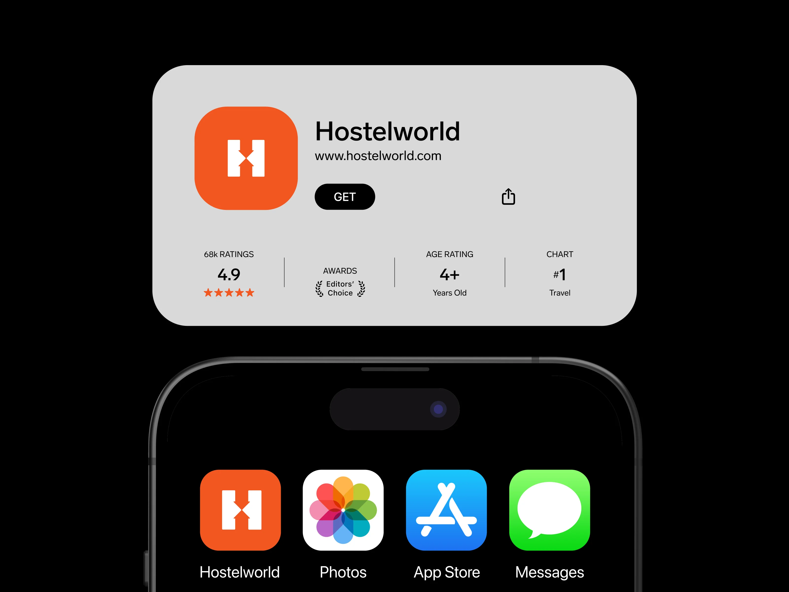
- App store ratings rose from 3.5 to 4.3 stars after the redesign
- Positive reviews surged across App Store, Google Play and Trustpilot
- Users praised the platform for its speed, reliability and trustworthiness
The user surveys and above mentioned metrics reflected deeper satisfaction with the platform’s usability and polish.
The platform’s scale and impact also speak volumes:
- 55 million platform visits annually
- 4.8 million bed-nights sold each year
- 10 million app downloads
- Trusted by more than 20,000 properties and millions of global travelers
- Over 14 million property reviews providing authentic, first-hand insights
Hostelworld’s redesign put travelers and hostel owners first.
For travelers, the new experience made it easier to find the right vibe, book on the go and connect with others, turning last-minute solo trips into something more social and seamless.
For hostel owners, streamlined tools meant less admin, more time with guests and a platform that’s easier to run.
The result? Higher ratings, stronger engagement and a shift from just booking tool to trusted travel companion. It’s a smarter, more human experience and a big step forward for the brand.

7. Final Thoughts
When the world hit pause, Hostelworld didn’t. Instead of waiting for travel to bounce back, they used the moment to rebuild, not just fixing what wasn’t working, but creating something ready for the future.
Together with ElevenSpace, they went beyond a redesign. They built a flexible design system that brought their web, mobile, and admin platforms together into one consistent, user-first experience.
This new foundation helped speed up releases, improved collaboration across teams and brought clarity to every part of the product.ore than a refreshed interface; it's a foundation for long-term growth, adaptability and trust.


.webp)
.webp)
