Most people think great UX means flashy design or intuitive buttons.
But at its core, UX is about behavior change, not features.
When you design an app, you're not just arranging pixels, you're shaping how people think, decide and act.
This is the core of financial app design: creating interfaces that influence real behavior and foster healthier money habits.
In that sense, UX is behavioral design and that makes it moral design too.
1. UX Is About Behavior, Not Just Features
Consider this: People aren’t rational decision-makers.
They procrastinate, avoid discomfort and rely on mental shortcuts.
Good UX meets users where they actually are, not where we wish they’d be.
Let’s look at just two examples of how behavioral quirks show up in real product decisions:
- Default Bias
Most users won’t change default settings, so your default is your design. Think about how auto-enrollment in savings plans dramatically improves participation. The same principle applies to app opt-ins, notifications, even payment timing. - Shame Avoidance
Users will do more to avoid negative emotions than to pursue positive ones. That’s why a budgeting app that says “You’re $200 over your restaurant budget” may backfire while one that says “You're getting closer to your savings goal” encourages continued use.
These aren’t “UX tricks”, they’re real human tendencies. If we ignore them, we’re not designing for people, we’re designing for robots.
2. Core UX Principles for Better Financial Habits
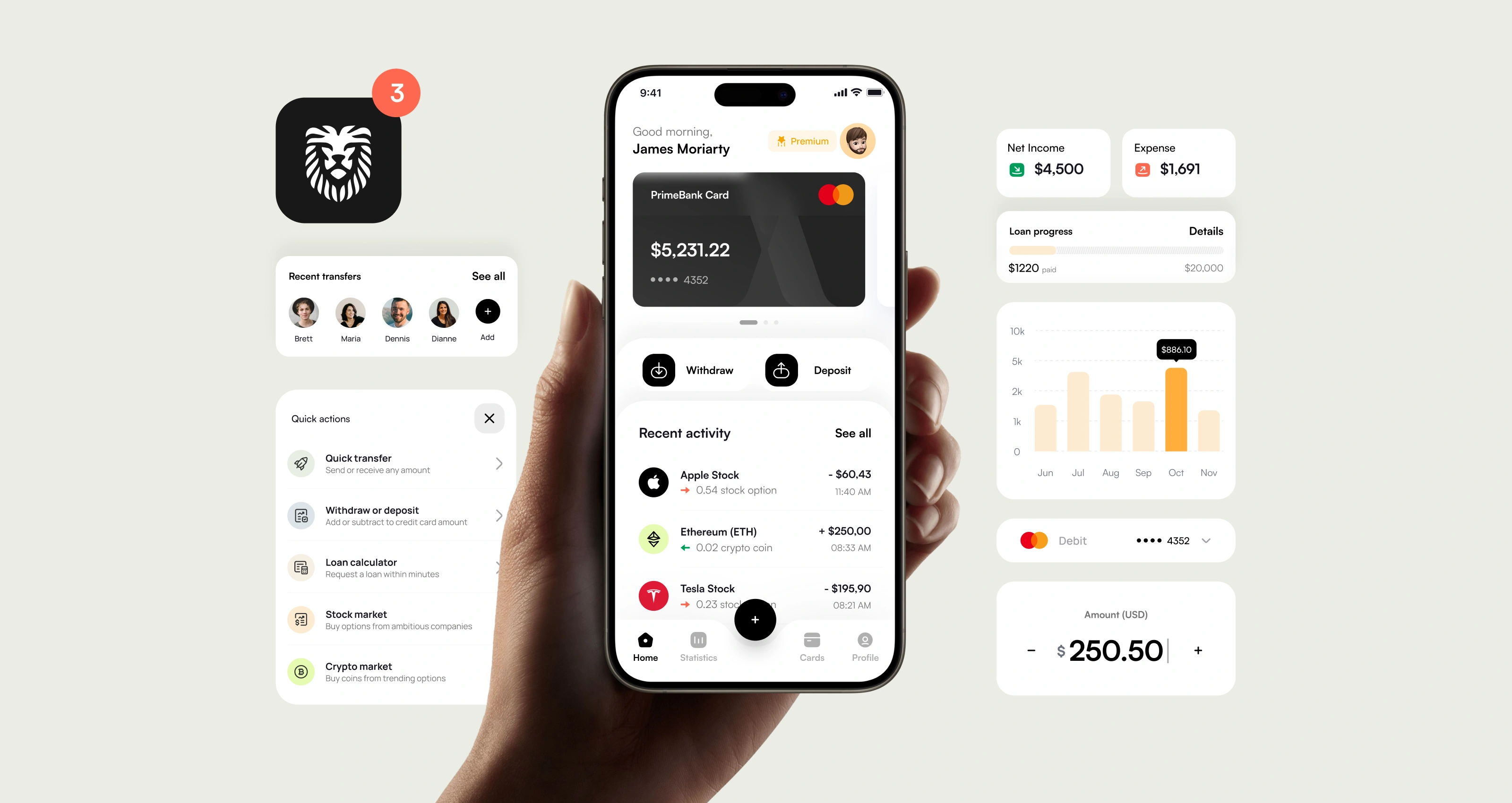
The best fintech apps don’t just work, they guide. They don’t overwhelm users with data or dazzle them with flashy charts.
Instead, they remove friction, build trust and make money management feel just a little bit easier.
In other words, great UX for fintech meets people where they are and helps them take the next step, no matter how small.
Let’s unpack what that actually looks like in practice:
2.1. Simplicity Over Complexity
Managing money shouldn’t feel like doing your taxes.
Yet for many users, it still does. Confusing menus, overloaded dashboards and unexplained jargon turn simple tasks, like setting up a savings goal or splitting a bill into stressful chores.
This is where simplicity wins. Think: fewer steps, clearer choices and flows that just make sense. And no, that doesn’t mean “dumbing it down.” It means speaking human.
Smart microcopy goes a long way here.
A tiny line that explains what “APY” means or how the “debt snowball” method works can turn confusion into clarity. When users feel informed instead of intimidated, they’re more likely to stay engaged and stick with the habit.
2.2. Visibility & Feedback Loops
You know that little thrill of watching your progress bar move? That’s the magic of a good feedback loop.
Whether it’s a savings tracker creeping closer to that dream vacation or a gentle heads-up when your weekly spending goes off track, real-time insights create awareness and awareness fuels change.
A well-designed spend tracking UI, paired with goal dashboards and subtle nudges helps users see the impact of their actions.
When progress is visible, the invisible becomes meaningful. And that’s where habits begin to shift.
2.3. Personalization
Let’s face it: money is personal. A college student doing gig work has very different needs than a parent saving for their child’s education.
So why should they have the same app experience?
Personalization makes fintech feel human. It’s about more than just inserting someone’s name, it’s about recognizing their goals, patterns and challenges.
Adaptive interfaces that evolve with user behaviour.
Think: smarter budgeting suggestions, relevant reminders, flexible goal setting. They don’t just feel nice, they’re essential.
When users feel like the app “gets them,” they’re more likely to trust it and use it.
2.4. Positive Reinforcement
Saving money isn’t always fun but it can be rewarding.
Small moments of celebration, like earning a badge for three weeks of consistent budgeting or getting a friendly high-five after hitting a savings milestone, can boost motivation more than you’d think.
This is where gamification shines (when used thoughtfully). It’s not about turning finance into a game, but about recognizing effort and rewarding consistency, not just big wins.
Because let’s be honest: we all enjoy a little dopamine when we’re doing something good.
2.5. Automation With Transparency
Automation is one of fintech’s superpowers: round-ups, auto-transfers, smart investing tools, they all help users take action without overthinking. But automation without clarity? That’s a fast track to mistrust.
Good finance ethical design puts users in control. That means showing exactly what’s automated, what’s optional and how to adjust it.
A simple toggle, a clear explanation or a “You can change this anytime” message can make the difference between “Wow, this app is helpful” and “Wait… where did my money go?”
Automation should feel like a helping hand, not a hidden switch.
At the end of the day, designing for better money habits isn’t about reinventing finance, it’s about making the good choice feel like the easy one.
With the right mix of empathy, clarity and thoughtful UX, even small design decisions can lead to big behavior changes.
3. Best-in-Class Product Patterns
When it comes to designing fintech experiences that actually help people build better money habits, there’s no need to reinvent the wheel. Some apps are already doing it brilliantly and there’s a lot we can learn from them.
Let’s take a look at a few standout examples that combine clean UI with smart, behavior-driven UX.
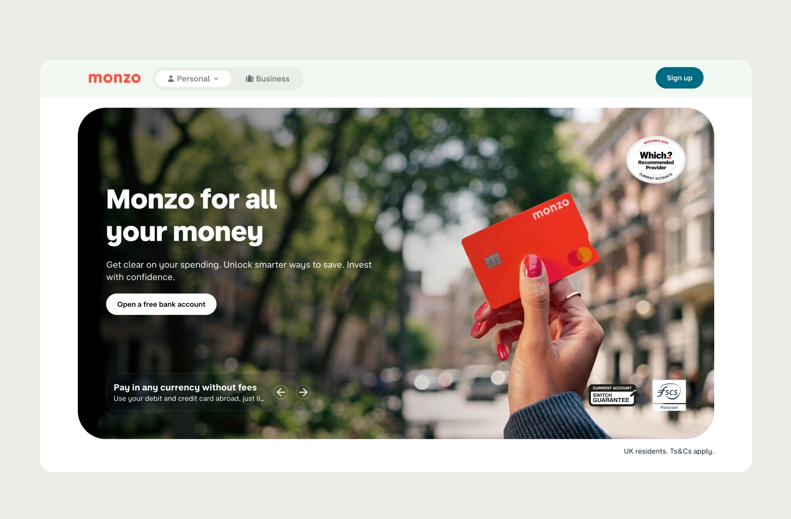
Monzo
Monzo’s goal‑based "Pots" are no gimmick, they resonate at scale. With 350,000 new Pots created every month and users saving roughly £100 extra per year via round‑ups, the behavioral shift is measurable and this rollout spans 9.3 million registered users.
Users can set custom goals (like “Trip to Lisbon” or “Emergency Fund”) and watch their progress grow visually. The tone is friendly and playful, helping to take the edge off what might otherwise feel like financial pressure.
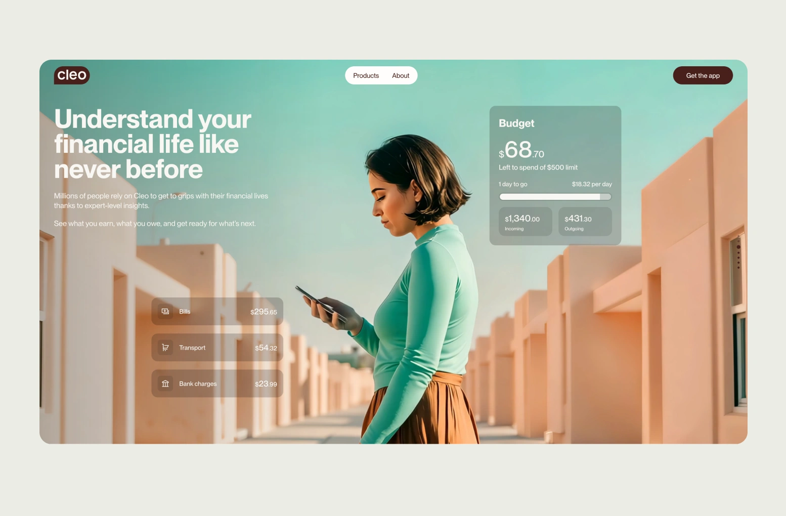
Cleo
Cleo turns budgeting into a conversation and it’s working. With over 7 million users as of October 2023 and revenue that has more than doubled year-over-year, this UX isn’t just engaging: it’s driving growth and retention.
Their witty, chatbot-style interface makes it feel like you’re chatting with a financially savvy (and slightly sarcastic) friend. Instead of cold data dumps, users get encouragement, spending insights and the occasional meme, all through a conversational UI that feels fresh, approachable and surprisingly effective.
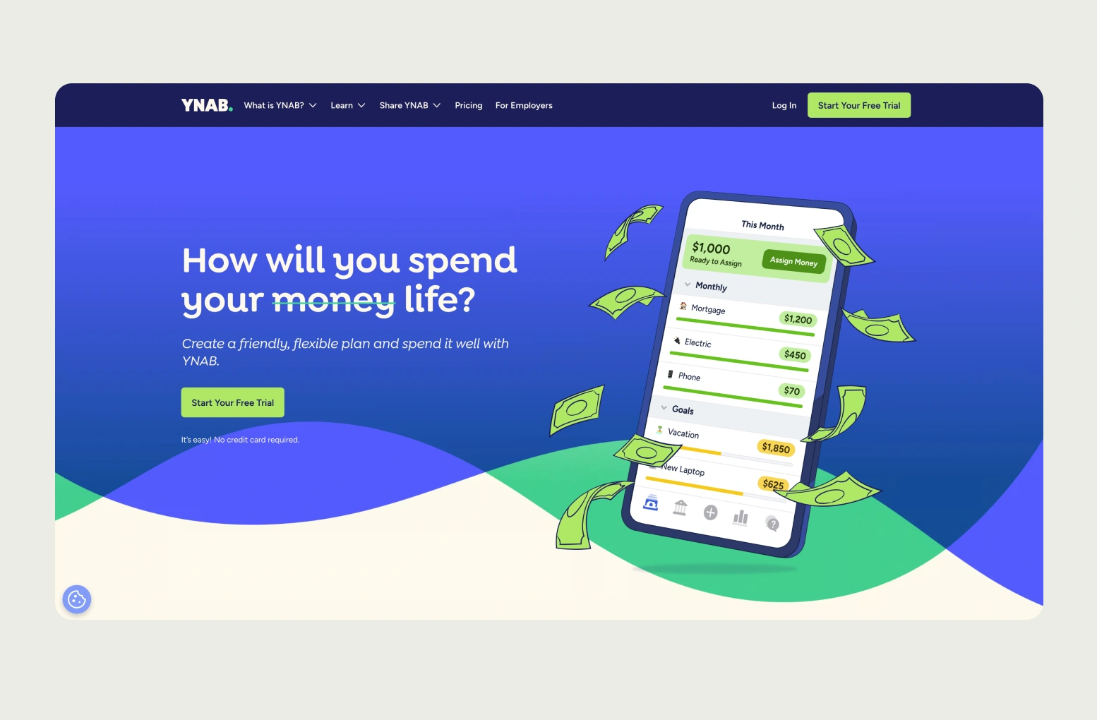
You Need A Budget (YNAB)
YNAB is a masterclass in predictive budgeting. It uses calendar-based views and forward-looking guidance to help users plan not just for now, but for what’s ahead.
Proactive alerts, like “You’re about to overspend on dining,” feel more like helpful reminders than scolding. And everything is framed around control, not restriction.
YNAB users aren't just budgeting, they're transforming financial health. Their data shows 74% of users pay off an average $27,744 in debt, 99% consistently pay bills on time and 92% report feeling less financial stress, making the case that UX-driven guidance translates into real-life impact.
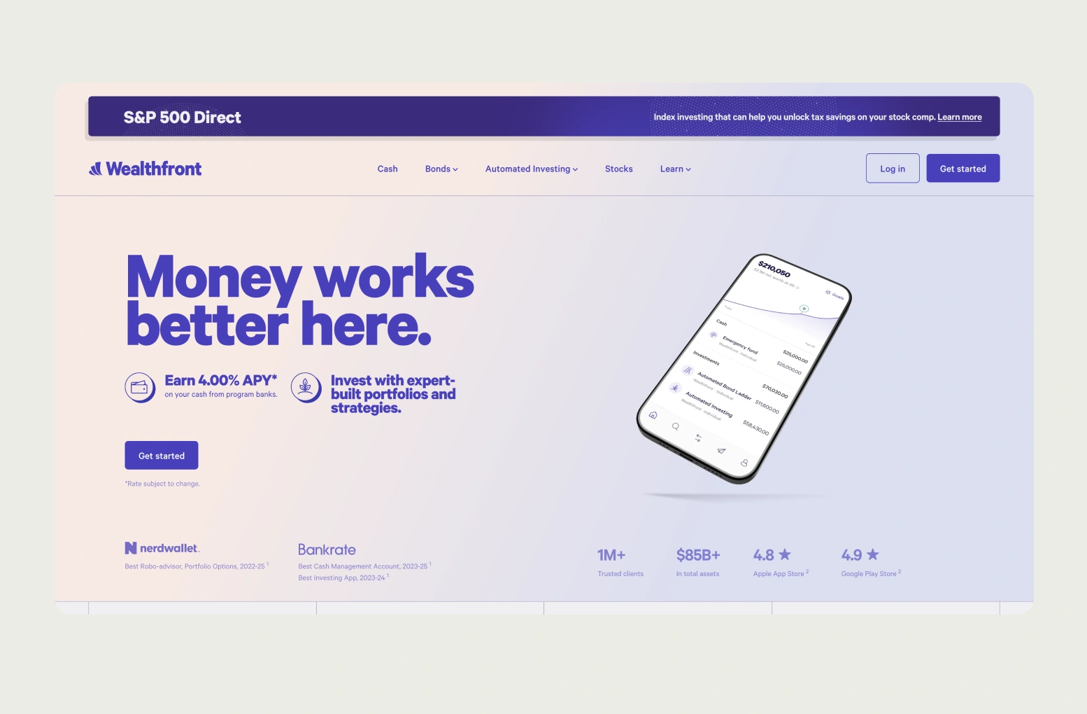
Wealthfront
Wealthfront takes the complexity out of investing. Its interface is sleek, minimal and confidence-inspiring, exactly what you want when your money is on the line.
With a clean layout, clear breakdowns and just the right amount of explanation, it builds trust from the first tap.
The design quietly says: “You’ve got this.”Wealthfront’s clean, trust-focused investment UI is not just pleasant, it’s proven. As of November 2024, it managed $75 billion AUM across 1 million accounts, about $75k/user average. Just a year earlier it had $50 billion AUM and 700,000 clients, with +140% revenue growth, showing how clarity and automation drive real growth
So what ties these apps together?
Despite their different audiences and goals, they all share a few common UX patterns that really work:
- Visual spend categorization with intuitive icons and friendly colors (because no one wants to decode a pie chart).
- Calendar-based reminders for bills, paydays and goals, making time a tangible part of the money picture.
- Progress tracking that celebrates growth instead of guilt-tripping about setbacks.
- Plain-language microcopy that explains terms without making users feel like they need a finance degree.
These aren’t just design flourishes, they’re behavioral design strategies in disguise.
They make money feel more manageable, decisions feel more doable and habits feel more sustainable.
That’s the whole point: great fintech UX doesn’t just make apps easier to use, it makes life a little easier to navigate.
4. Trust, Inclusion and Financial Literacy
When you're designing a product that touches people’s money, you're not just designing an app, you’re designing for trust. And trust isn’t something you can fake or fast-track.
It’s something you earn, moment by moment, screen by screen.
Money is deeply personal. People bring their whole emotional history with them when they open a finance app: pride, anxiety, goals, regrets.
Let’s be honest: not everyone feels confident about their finances. Some users feel overwhelmed before they even log in.
That’s why transparency matters. A clear explanation of how data is used, a kind message when something goes wrong or a reassuring tone when someone’s balance is lower than they’d like, these things go a long way in building psychological safety.
Think of it as designing a space where people feel okay being honest with themselves about money.
But trust is just the start. To really make a difference, UX for fintech needs to be inclusive, because not all users walk in with the same financial knowledge or even the same access to banking systems.

A college student trying to figure out how to build credit for the first time needs different support than a freelancer juggling irregular paychecks.
Let’s not forget the millions of gig workers, immigrants and unbanked individuals who’ve been underserved by traditional financial tools.
Designing for them means being flexible: offering options for irregular income tracking, skipping the jargon and removing assumptions about 9–5 jobs or fixed monthly budgets.
Financial literacy should be baked into the design, not buried in a help center. Simple tooltips, friendly explanations or even contextual mini-lessons can help users feel smarter and more in control without ever leaving the flow.
It all comes down to this: don’t design for ideal user personas.

Design for real people. People with messy bank accounts, shifting incomes and real goals. People who need support, not just features.
Because when you design with empathy and inclusion in mind, you’re not just building a more useful product, you’re building a more financially confident generation.
5. AI in Personal Finance Apps: Smarter Coaching, Safer Design
AI is no longer a novelty in fintech. In 2025, it powers much of what users see, from personalized insights to predictive nudges. Done well, it feels like a smart, trustworthy guide: flagging spending trends, suggesting budgeting tweaks, even projecting long-term outcomes from small choices.
But AI isn’t neutral. It reflects the goals of whoever builds it. And in personal finance where stress, stakes and consequences run high, that makes ethical design non-negotiable.
The Risk: When AI Nudges Go Wrong
Imagine this:
A user logs into their finance app the day after payday. They're shown a notification:
“You’ve got extra cash! Why not upgrade to VIP status for $49.99/month?”
On the surface, it’s clever. The algorithm spotted surplus income and offered a timely upsell. But it completely ignores the context: that the user is trying to pay down debt or build an emergency fund.
The result? A nudge that feels manipulative not helpful.
Now flip the script. What if that same user saw:
“Hey, we noticed your income landed, want to move $50 to your emergency fund automatically?”
That’s good AI design. It’s context-aware, user-aligned and confidence-boosting. It nudges toward a healthier behavior based on the user's long-term goals, not just the business’s short-term metrics.
This is the fork in the road that every AI-powered fintech tool now faces:
Empower or exploit.
Guide or game.
Serve or manipulate.
Why Guardrails Matter
Even the best models can “hallucinate” or misfire. In finance, that’s not just annoying, it’s dangerous. Picture a chatbot falsely reassuring someone that withdrawing from a retirement account has no tax impact. That’s a financial landmine.
To keep AI useful and safe, thoughtful design must build in clear constraints. Key safeguards include:
- Human override: Users should always be able to dismiss, modify or question AI guidance.
- Confidence scoring: Flag low-certainty responses, rather than presenting guesses as facts.
- Audit trails: Log AI recommendations for both user transparency and internal review.
- Clear labeling: Make it obvious when users are talking to AI vs. human advisors.
- Consent-first defaults: Let users opt into AI features with full context, not buried toggles.
These aren’t backend decisions, they’re frontline trust signals. Each one communicates: “You’re in control here. We’re here to help, not to trick.”
Tone Matters Too
Conversational AI can lower the emotional barrier to financial guidance. But tone is everything. A chatbot that jokes when someone’s just missed rent? That’s not quirky, it’s careless.
Instead, AI-driven coaching should lean into empathy and clarity, with suggestions that feel like they come from a wise, kind friend.
Celebrate wins, gently flag risks and always, always let users stay in the driver’s seat.
Smart, But Human-Centered
At its best, AI makes good money habits easier. But good design ensures it never makes bad decisions feel tempting or hides risks behind sleek language.
The goal isn’t to sound smarter than the user.
It’s to help them feel smarter about their money.
6. Measuring What Matters: Behavior Over Clicks
Most fintech apps obsess over vanity metrics: daily active users, session length, click-throughs. But if you're designing for financial behavior change, the real question is:
Are users actually improving their financial health?
- Are they saving more?
- Reducing high-interest debt?
- Avoiding overdrafts?
- Sticking to budgets longer?
These are the outcomes that matter. A product users return to isn’t necessarily helping them. But a product that helps them succeed will become sticky on its own.
A Framework for Meaningful UX Metrics
Instead of stopping at surface-level stats, connect design choices to user behavior and then to business outcomes:
- Savings progress bar
- Behavior Outcome: Higher savings goal completion
- Business Impact: Increased user retention
- Behavior Outcome: Higher savings goal completion
- Bill reminders with calendar
- Behavior Outcome: Fewer missed payments
- Business Impact: Lower churn, improved trust
- Behavior Outcome: Fewer missed payments
- Personalized nudges
- Behavior Outcome: Increased budgeting streaks
- Business Impact: More frequent app engagement
- Behavior Outcome: Increased budgeting streaks
- Friendly overdraft alerts
- Behavior Outcome: Reduced account overdrafts
- Business Impact: Fewer support tickets, higher NPS
- Behavior Outcome: Reduced account overdrafts
- AI-generated suggestions
- Behavior Outcome: Smarter spending choices
- Business Impact: Higher lifetime value (LTV) per user
- Behavior Outcome: Smarter spending choices
Validate with Real People
Example: You’re testing a weekly “keep saving” notification.
- Group A gets: “Keep going - you’re doing great!”
- Group B gets: “You’re $20 closer to your Hawaii trip!”
Don’t just measure opens.
Track: Did users transfer more to savings in Group B? Did they come back next week?
That’s real behavior change and it tells you whether your design is working.
Measure Habit Formation Over Time
Designing for financial behavior means playing the long game. Look beyond short-term engagement:
- Budgeting streaks (e.g. 3+ weeks in a row)
- Recurring goal contributions
- Decline in crisis behaviors (e.g. overdrafts, late fees)
These patterns signal that users aren’t just using your app, they’re building confidence.
Cohort analysis over 30/60/90 days can reveal whether new UX features actually drive lasting habits.
Because in the end, the goal isn’t more taps or longer sessions. It’s a healthier financial life, shaped one small decision at a time.
7. Looking Ahead: Embedded Finance, Contextual UX
The future of fintech UX isn’t just smarter, it’s more responsible. As embedded finance integrates money decisions into everyday moments (like booking a ride or checking out online), designers face a new challenge: how to guide users without overstepping.
These aren’t just transactions, they’re micro-moments of influence. And with them come new UX questions:
- How do you encourage savings during checkout without sounding preachy?
- How can a ride-hailing app help users round up to savings goals, without adding friction?
- How do you offer credit suggestions in a way that informs, not exploits?
Tomorrow’s winning fintech products won’t just be flashy, they’ll be context-aware, consent-driven and trust-centric.
Designers must consider not only the UI, but also when, where and why financial nudges appear.
The pace of innovation is fast, but the opportunity is massive. UX is now the frontline of financial trust and the bridge between short-term behavior and long-term well-being.
8. Conclusion: Design With Empathy, Design for Change
The fintech apps of tomorrow won’t just track behavior, they’ll shape it. That’s not a trend. That’s a responsibility.
As designers, we’re no longer just building tools for transactions, we’re creating the daily touchpoints that influence how people think, feel and act around money. When done right, that influence can be life-changing.
Empathetic design doesn’t mean coddling users. It means meeting them where they are.
It means reducing shame, celebrating small wins and making complex decisions feel a little more doable. And that’s more than just good UX, it’s a quiet kind of public service.
As fintech UX 2025 evolves, designers must balance innovation with ethical considerations and user trust.
So whether you're sketching out a new budgeting feature, refining your onboarding flow or designing an AI-powered coach, ask yourself:

Will this help someone feel more in control of their money?
Could it nudge them toward a healthier habit without judgment?
Might it make a stressful moment feel just a little lighter?
If the answer is yes, you're doing more than designing a product.
You’re designing a better financial future, one screen at a time.


.webp)
.webp)
